Monday, December 31, 2018

December Challenge, Mixed Media

Our challenge this month is to step outside our comfort zone and use various media together, or a medium we don’t normally use, to mix it up and have fun! Following is how each member met the challenge.
* * *
Cindy's Response to the Challenge

No problemo for me...I was housebound due to knee surgery AND a major snowstorm. So I looked around at what was at hand and began working, out of my comfort zone, with some new medium which included q-tips, homemade ink, colored pens and eco-printed rejects. For the full story on this particular effort go to my blog here.


These are misprints from my eco-printing process making note cards.  I wanted to see if I could salvage them or at least have a little fun.  Using my homemade inks and then doodling with some colored pens I got the results below.  Not earthshaking art but I had fun experimenting with line and color and moving the eye around.  No idea what to do with them now....but that was not the challenge!!


Cindy Michaud - art@cindymichaud.com

* * *
Donna's Response to the Challenge

I  really debated about which way to go on this challenge and decided to tackle watercolors again.  I  started out in watercolors, they looked so serene, so simple, so forgiving, so easy to use and carry. I was so wrong. They were none of these things except easy to carry. I was immediately reminded why I switched to oils and collage.
With someone of my temperament -- impatient, changeable, yada yada--watercolor is anxiety producing not calming. There is no going back, going outside the area, changing colors in midstream as you will see from my paintings.
Here are two pieces I did of  the same scene.  I really liked the first one I did, gentle colors, whimsical, spontaneous but then I decided to add a few trees behind the houses and it was just awful and I couldn't fix it! The second painting is more stick to the plan but looks labored and just lacks something.  Despite all of this I am going to try some more watercolors.  I liked doing it once I got lost in it and maybe I can learn to relax and stick to the plan.

 Scene 1: Notice how I tried to add the trees.
I even tried to turn the trees into mountains
but that didn't work.

 Scene 2:  No trees. Already one lesson learned but the
sense of spontaneity is gone.

Both scenes together.


* * *
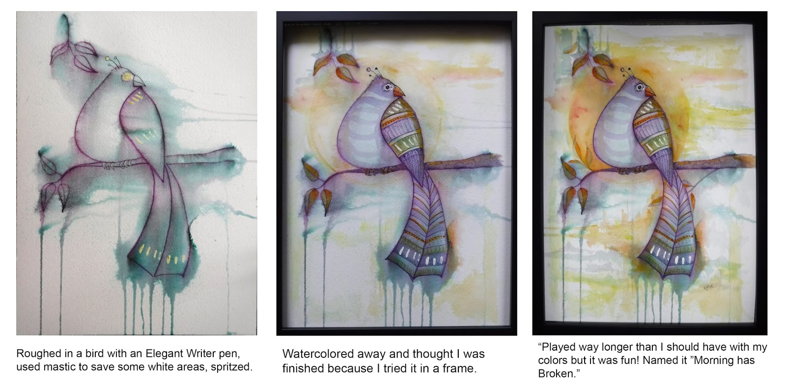
Kathy's Response to the Challenge


Collage is definitely not my media, so I saw this challenge as the perfect opportunity for me to use up some of the many parts and circuits I like to extricate from my old laptops. I searched for a couple of real beauties, mapped them where I wanted on my watercolor paper and started ruling some lines with Elegant Writer pens that I could wet to get some interesting starting shapes and colors.
9x12 Watercolor sheet with space for the circuits marked off
and Elegant Writer Pen lines sprayed with water.

I still have a data flow template from my programming days so I drew some symbols on the background and filled them and the background in with watercolors. To add some more "mixed media" I thought I would embroider with some really shiny special thread on the paper. Disaster! Slow, hard to keep my lines straight, and way too easy to snag the thread on the little barbs of the circuits. That little square one is sharp!
Definitely need to rethink the embroidery idea!

I actually love it when I think I've ruined something because then it doesn't matter what I do to it. So, I went to town with adding gold foil, white, gold and green-gold acrylic applied with a pin, colored pencils and things through stencils. Then I emptied my sewing machine of thread and by staying away from the circuits, I was able to stitch some straight lines to get perfect holes. Hand sewed them in with my fancy threads.

I used a micron pen to add a little Hello World code in Basic, Cobol and Pascal (that tells you how old I am). Topped it off with more watercolors and colored pencils. Fun, fun, fun! I have to sign it, name it and put it out of sight so I don't keep adding more stuff to it! 

May the Circuit Be Unbroken
Mixed Media, 9x12
by Kathy Garvey
Just for fun I started another watercolor collage using a really old circuit. I was barely in to it when my oldest daughter decided she loved it. I added some things meaningful to her in some of the circles and kept it much simpler than the other.

Crossed Circuit
Mixed Media, 9x12
by Kathy Garvey
* * *
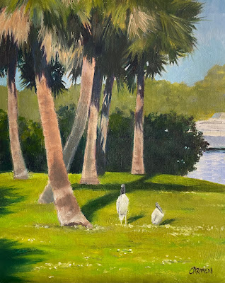
Carmen's Response to the Challenge


 Woman in Gold
Mixed Media, 11x14
by Carmen Beecher

Having just been to Vienna, I had Klimt on the brain, so I used the challenge as my excuse to use gold gesso, gold acrylic paint, stamps, pen and ink, and oil paint in a Klimtish manner. I painted the face in oils, then just went a bit crazy with the rest of it. I had noticed that with Klimt, too much was not too much. None of that "less is more" nonsense, although I didn't completely cover the canvas with designs. I didn't want her face to get lost.
* * *

Carol's Response to the Challenge.

**********


I packed up in November and left my North Carolina home, heading south to the beaches of Florida.  The plan is to stay in a beachside condo until the mountains become a little more hospitable......meaning warmer!

Even though, we packed two cars to the gills, I could not bring everything I wanted or thought I needed.  As a result, the only art supplies I brought were my oils.

Why am I telling you this?  I am feeling a little guilty, for not doing a new project for the challenge, but showing you one of my past adventures into other medias.


These are two tiles, painted with alcohol inks.  A few months ago, I became quite interested in working with alcohol inks and experimented with them on several supports.  These are two of my early efforts.  Nothing special, but I do like the colors, and this challenge has re-ignited my interest in this process.  I cannot wait to return home, to my studio, to dig out my inks and further my experiments with them.

Carol Schiff
www.CarolSchiffStudio.Etsy.com

********

Fay's Belated Response

Ink drawings with water color wash were how I started my limited art career. I drew and colored very simple wild flowers. No depth, no detail, but lovely colors. I haven't attempted those in years, but thought I would take up the medium again for this challenge and try to apply it to a scene from our hotel window on a recent trip to San Juan, Puerto Rico. Below is the first attempt at a watercolor with ink drawing that tries to capture the San Juan Bautista Cathedral. After this feeble attempt, I decided I should take a photo and try again at home. The third work is a my attempt at an ink drawing with a wash. I have a long way to go to perfect my drawing skills, not to mention to conquer watercolors, but I had a lot of fun doing this challenge.


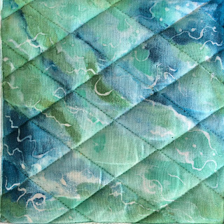
Jean's Response to trying a different media

What are these images (below), you may ask? 
Well, take some blank, white, quilted pot holders. Hmmm, what to do with them? Gifts? Yes!
Get some acrylic paint, white glue, permanent marker, and a little creativity. 
My goal in choosing a new medium is to use the glue as a resist, then paint the surface with acrylic. Once dry, remove the glue. (see the third image) That proved a challenge. So then I concentrated on drawing on the quilting with a permanent pen. 
Still have more holders and I'm determined to find a better resist. Any suggestions? 
Happy New Year! 


Tuesday, December 25, 2018

A Very Special Day


I hope you all enjoy your holidays and find peace and love in the upcoming year!  I want to thank all my online friends who visit this blog and follow my art.


Our painting group, Pieces of 8, at our fun Christmas luncheon at The Dove. The Dove always makes  it a specal day, they do it right!

Clockwise, Fay on the left, Carmen, Denette Jean, Donna, Me, Mary and Kathy.
Carol Schiff
www.CarolschiffStudio.blogspot.com

Thursday, December 20, 2018

Mixing it up with Elegant Writer Pens!

by Kathy Garvey
Our Pieces of 8 challenge this month was to either create a mixed media work or use a media we seldom used. I decided to collage, something I rarely do, and mainly because I wanted to finally use some wonderful circuit boards that I've been saving for ages. (Some of them are from the 70s and one seems to be a magnetic tape controller circuit for a Univac III. I used to be a tape librarian at the International Association of Machinists and Aerospace Workers. Brings back lots of old memories!) Watch for our mixed media blog entry on the last day of the month.

In trying to mix the media as much as possible for the challenge, I also got out my Elegant Writer Pens. And then, after meeting the challenge, I continued to use up my 1970's circuits and the Elegant Writers. I like these Calligraphy pens for the random way they run and bleed colors when you spritz them with water. (Though why someone who does calligraphy would want a pen that bleeds when wet I haven't figured out!)

Anyway, here's the process using three different examples. (Click to enlarge further and be able to read the text.)


When I ran out of circuits, I went back to the birds! I should really quit and work on getting my house ready for Christmas. But painting is so much more fun!

Ralph carries the pens at Ralph's Art Supply and I'm hoping if this process looks fun to you, you'll get some and give them a try.

Wednesday, December 19, 2018

Daily Painting, Small Oil Painting, Mountain Landscape Painting, 6x8" Oil, "High in the Sky"

If you live in Colorado, you probably don't consider 6,000+ feet as high in the sky.  That is the altitude of Water Rock Knob, North Carolina, which is depicted in this daily painting

purchase here
110 + shipping
I returned from a week touring Colorado.  It is incredibly beautiful and wild.  Where else can you go to see a herd of antelope grazing, or big horn sheep!  The prairie is as gorgeous as the mountains.  I wasn't expecting the beauty of rolling hills, of mother deer with their fawns walking through the waist high grasses.

But this painting is from a kinder, gentler mountain.  What is high in the Blue Ridge is a starting point in the Rockies!  I love both places.  Being a flatlander, I feel blessed to be able to visit these stunning landscapes.

Thanks for viewing my blog today.


www.CarolSchiffStudio.blogspot.com

Tuesday, December 11, 2018

Friday, December 7, 2018

Southwest Vista

One of the most challenging landscapes for me is the Southwest.  I love looking at the landscape, the colors the terrain but it is difficult to capture that with such a limited palette.
 Everything about it is like the flip side of the Northeast.  It seems to barren so devoid of lushness and color.  When you really look at it though it has it's own rugged, start beauty and the colors of the desert can be just as intense as the color of a forest.
This 5x7 shows the plain brownness of the desert with the complex colors of the hills in the distance.
Donna Vines


Southwest Vista


donnavinesart.blogspot.com
donnavinesart.etsy.com
 

Monday, December 3, 2018

Dora Canal, Oil Painting, 24x18 Florida Landscape


Our painting group, Pieces of Eight, was in Mt. Dora, Florida, and we went on a cruise across the big
lake to the beautiful Dora Canal. The canal is pretty short, and turns into this lovely river. There is something so intriguing about a swampy river with cypresses and live oaks. The more you look, the more you see, like the plants that grow on the oak limbs, or (though not in my painting) the occasional gator eyes and nose peeking from the water.
I've decided to add the occasional cartoon to my blog, as a kind of journal illustration of what's going on in my life. Hope you like it.
Carmen

Friday, November 30, 2018

November Challenge, Do an Avant-Garde Work of Art

This month we were challenged to create a work of art inspired by an artist or movement considered avante-garde. The term "avant-garde" covers a plethora of styles and simply means art that is very modern or original in comparison to the styles of the period in which it is made. (Artists who pop to mind are Picasso, Kandinsky, Mondrian, etc.) For some of us it means stepping way out of our comfort zone, which is the whole point of our challenges.

-------------------

Donna's response to the challenge
Well this challenge lived up to it's purpose.  I was out of my comfort zone in a few ways. For some reason I thought it would be better to use acrylics, not so and I had no idea Cubism would be so restrictive to me!!  You have to color inside the lines, which is not good for me.
Cubism is breaking down a subject to a basic geometric form and painting it in a flat manner.  I picked two very round subjects thinking that would make an interesting contrast. 
This is what a dish of pears and a teapot looked to me in a Cubist style.


Donnavinesart.Etsy.com
Donnavinesart.blogspot.com

----------------
Carmen's response to the challenge

"The Death of Truth"

I used Picasso as my inspiration, and the sun/lamp is almost a direct steal from his painting, "Guernica." I think the painting is self-explanatory.

Carmen Beecher

carmensart.etsy.com
carmenbeecher.com
--------------------------
Kathy's response to the challenge

I love Klee, Kandinsky, and Picasso so I had a hard time choosing who to use as my inspiration, but settled on Kandinsky because his art is just fun to me and I thought I could even try it in watercolors. He really worked to make his images with non-representative symbols, just lines, squiggles, dots and geometric shapes so that it inspired a "feeling" rather than a "meaning" for observers.


Above was my "dry run" just using a mix of his favorite symbols and his way of color blocking them and filling in the background. When I discovered, that despite his attempts to avoid representation, he had put a tiny bird in one of his paintings I really felt he was a kindred spirit. So I included one, too. (Click on the image to zoom in and find it.)


Then I did a larger piece mimicking elements in some of his more geometric paintings.


While this is representative of his painting style, it has meaning (at least to me) as each Kandinsky inspired circle contains the first initial of one of my ten grandchildren.

Kathy Garvey
-------------------------
Mary's response to the challenge

Channeling Chagall

While still in college I saw Chagall’s “I and My Village” and was enchanted by the color, the design and the sense of joy he captured on a huge canvas. I’ve always loved his work, but found it hard to copy when the Pieces of 8 project of copying the masters took place almost a decade ago. Trying to capture some of his joy and playfulness in a composition of my own was more fun.
Mimicking Miro 
Then, for fun, I tried a design in bright colors, encouraged by Kathy, who is a master of design.  Fay thought it reminded her of Joan Miro’s work.

Mary Warnick


-----------------------

Jean Thomas Looks at Winslow Homer

“Fox Hunt” by Winslow Homer was a painting I chose to explore. I'm not sure it is avant gard, but it was inspired by a book on Homer I picked up at an estate sale. It’s a large (38” x 68”) oil. Painted in 1893, late in his career, after he moved to Prout’s Neck, ME. It was reproduced in black and white and was only 3” wide. Still it intrigued me.
Homer’s watercolors were more numerous than his oils and he often used the watercolors as preliminary studies. Also, he chose watercolor when he traveled to the Caribbean. This painting was of the coast of Maine, a frequent subject for him at that time.
Once I researched the painting in hopes of getting a better reproduction of it, the story got interesting.  I discovered what seemed to be black blobs in the upper right corner, were crows. And what is going on is that the crows (usually the prey) are out to get the fox! It’s cold, it’s bleak and the fox is running for his life. He is stretched across the canvas, slowed by snow and hunger.  Ahead of him is only water. No escape from fate.
I wondered if Homer ever did do a watercolor of this subject, and if he had, how would it have looked?  I wish I could see the original to see the details and the colors he chose. It is hanging at the Philadelphia Academy of Fine Arts. So here’s my version of “Fox Hunt” in watercolor.
Thank you Mr. Homer.


Monday, November 26, 2018

On my Way to Hollywood!, Daily Painting, Small Oil Painting

An unexpected, but exciting thing has happened!

Warner Brothers has purchased one of my paintings, for set design in their new movie "Romeo".

SOLD
The movie is filming now, in Brooklyn, starring Joaquin Phoenix.  I believe it is scheduled for release in the fall of 2019.

I have been so fortunate, as I am currently under contract with CBS, to use two seascapes, in their TV series PI Magnum and Hawaii Five-O.

SOLD


SOLD
  I know what you are thinking.........How did this happen?  How did they find you?

Well, both of these contacts were made through my site on Etsy.  I did nothing to attract these offers, other than regularly post on Etsy and maintain a presence online.  It can happen to you too!

Good luck!!

Carol Schiff
www.CarolASchiff.com
www.CarolSchiffStudio.etsy.com

Friday, November 23, 2018

Across the Marsh

This 6x8 marsh oil is really one of my favorite marsh paintings.  It is painted from a photo I took looking across the marsh in Ipswich, MA.  A beautiful place with a beautiful coastal area. 
I think of the phrase "through a lens lightly" when I look at this.  It seems to be all suggestion with hints of homes, sand, water and the beautiful green of the hills.
Donna Vines


Across the Marsh


Donnavinesart.etsy.com
Donnavinesart.blogspot.com


Sunday, November 18, 2018

November Seascape, Small Oil Painting, Daily Painting, 5x7" Oil on panel

We are back in Florida, to spend the holidays with our family.  It is so wonderful to be back on the coast.

Purchase Here
 Smelling the salt air, hearing rhythmic sound of the waves and screeching sea gulls.  Life is good when you have sand between your toes!


What can be more soothing than the waves rushing to shore?

I have to admit, I don't have the courage to paint on the beach.  This piece was done using a photo I took, during my morning walk.

Have a beachy day!

Carol Schiff
www.CarolASchiff.com
www.CarolSchiffStudio.etsy.com


Friday, November 16, 2018

Blue Teapot

Well I did it again.  I thought I was over my teapot mania but I guess not.  What is it about that round, plump little shape that so intrigues me?  I know that teapots come in all shapes and sizes but the cubby little round ones are my favorite. 
I painted this little 5x7 for a group challenge where we could use only red, blue yellow and white.  I used a beautiful mixture of all those colors to make the background, that was the challenge.
Donna Vines

Blue Teapot

Donnavinesart.blogspot.com
donnavinesart.etsy.com

Friday, November 9, 2018

Daisy, Daisy

I think of all of the paintings I have done of flowers this is one of my favorites.  This 5x7 oil was painted from a photo that a fellow artist took for a challenge we did.  The challenge was to take turns picking a photo and each do our interpretation of that photo.  It is always fun to see how different each person sees something and the creation that comes from that vision.
At first I tried to be realistic in my painting but it just didn't seem right.  I wanted to be looser and freer, just like the flower was.
Donna


Daisy


Donnavinesart.Etsy.com
Donnavinesart.blogspot.com

Ballard Park, Original Oil on Canvas

  I had not painted outside in two years, so this was quite a challenge. It was one of those paintings I had to improve upon in the studio. ...