Showing posts with label small paintings. Show all posts

Saturday, February 1, 2020

January Challenge: Using Metallic Colored Pencils

The challenge this month was to use Donna's Christmas gifts to us--metallic pencils.
 * * * * *
Carmen's response to the challenge:

I found it hard to get a lot of color from the pencils without many layers, so did this experiment using watercolor first. Unfortunately, the best part was the watercolor. I didn't like the girl's face, and I thought about all the paintings I've seen with the heads cut off at the top. I decapitated my subject and realized that didn't work either. Then I added the unfortunate designs in the background with the metallic pencils, as well as the designs in the robe. Some things you just can't fix.

I went simpler with the pear, below. I put down some green watercolor then used the pencils for the rest. The orange color is from a regular colored pencil.
www.carmenbeecher.com 
www.carmensart.etsy.com
www.carmenbeecher.com

* * * * *

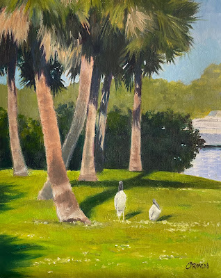
Carol's response to the challenge:
6x8"


As an oil painter, I feel I am experiencing a block.  So this was a perfect challenge to get me in a creative mood again.


I chose to do a mixed media piece, using the metallic pencils, alcohol inks, and marker on yupo paper.  No, I did not have a plan!  I did watch a couple you tube videos on creating with the inks.

I found it to be both frustrating and fascinating.  I think I will be trying this again.

www.CarolSchiffStudio.etsy.com
www.CarolASchiff.com
www.CarolSchiffStudio.blogspot.com

***********************************************
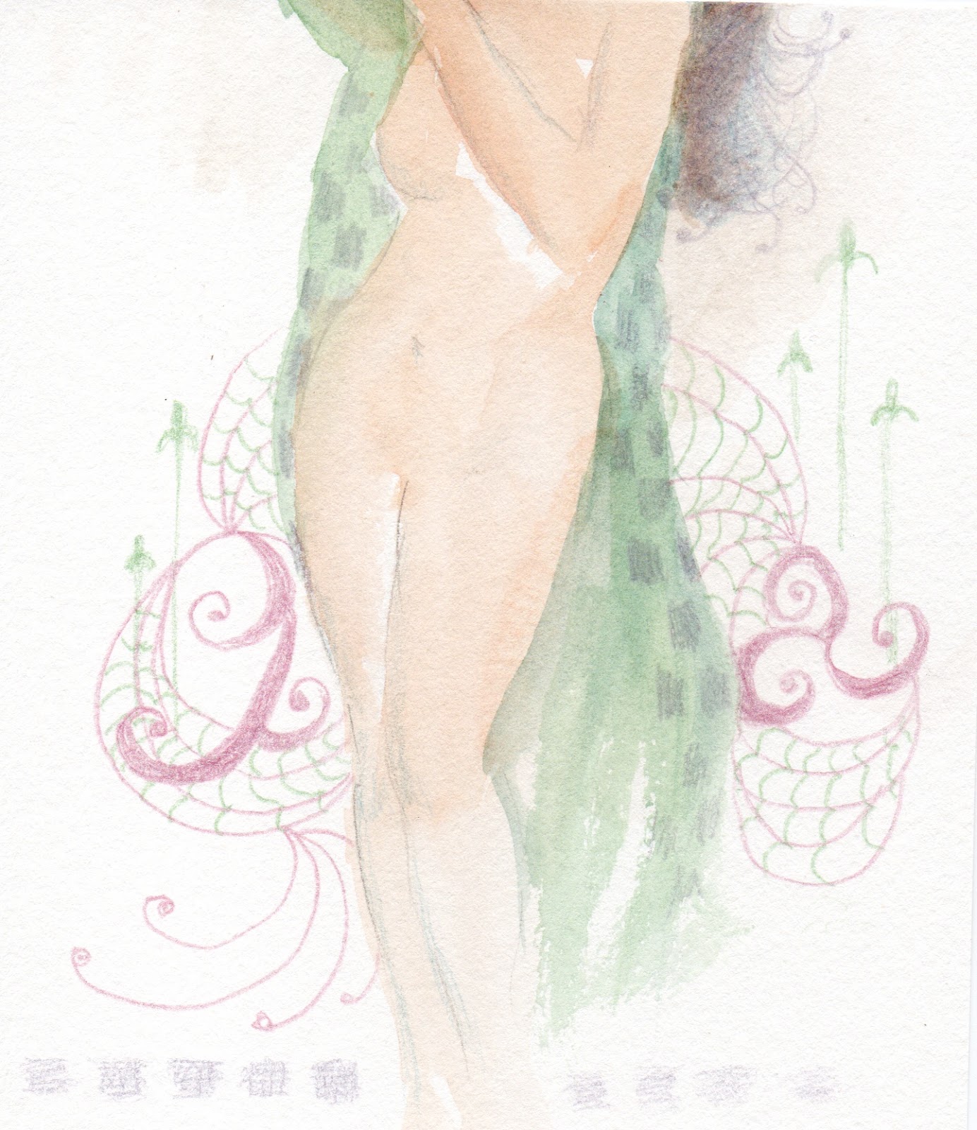
Mary's response to the challenge:

I had a photo that I wanted to use for a major watercolor painting.  I used the metallic pencils for a drawing, but wanted brighter color, so I used some colored pens to enhance the color.  More pencil, more pen, on and on, until I ended up with this little drawing.  It was fun, but not exactly great art.

I think the experiment did help with the watercolor, which is almost finished and will be entered in the Splash Show in February.  This is the Brevard Watercolor Society's big annual show.  Hope all who live in the area, or are visiting, will make an effort to attend. It's held on February 15th and 16th at the Azan Temple on Eau Gallie Blvd.

Mary Warnick
**********************
Kathy's response to the challenge:
Right away I sketched up an idea of a hummingbird at my hanging hibiscus for a future watercolor using the metallic colored pencils from Donna. They worked well on the smooth paper notebook she also gifted everyone.
Premio Metallic Colored Pencils and notebook Donna gave us each for Christmas
When it was decided that our first challenge for the new year would be creating something with her gift, I started a little bird in the same notebook. The first image below was heavily influenced by my photo reference of a little chickadee. The second is my attempt to make him a little more stylized. Both were fun to do as the pencils just glide across the paper. 


Kathy Garvey
**********

Donna's response to the challenge:
This was a tricky one.  It seemed so simple colored metallic pencils, oh boy.  Well it turned out that the metallic look just did not transfer onto paper as we had hoped.  There was no real shine to it.  I wanted the metal to look like metal.  I tried several things.  First I had pretty good luck just on plain paper but...
You can see that the metal element was not there.  It just looked like colored pencil.


I then tried black paper but the only way the metal effect showed was if I took a photo with the flash on.  So, that didn't really count.

Finally I experimented with my fellow artist Carol and liked this look the best.  There is paint and pencil in this pouring. 
                                                    
                                                              Donnavinesart.etsy.com
     
Fay's response to the challenge:

This challenge was particularly challenging for me because I am still learning to draw, after all this time, and in addition, I could not get the pencils to give me the color I wanted.


Next, I thought of trying to do a collage to get the needed color, but realized I would have to start over to get anything I liked. Instead, I just had the computer do the work for me. I brightened and intensified the color and called it a day.


Oh, wait. I did decide to take some more instruction in drawing via a website called RAPID FIRE. Just my speed. And in addition, I decided to express my frustration in a two couplet ditty. See below.

Oh little flower. Oh challenge mine.
On you I’ve spent my precious time.

I see it very clearly now.
To draw, I really don’t know how.

Fay Picardi 

**********************

Monday, September 30, 2019

September Challenge, The Perfect Pair or Pear

The challenge for September is to produce the perfect pair or pear. Hmmm....

* * * * *

How Carol met the challenge


I have painted many, many pears in the last 25 years.  There is something that draws me to them, and their slightly feminine shape.  

This is my favorite attempt, although I would never call it perfect.

Carol Schiff


***************

How Carmen met the challenge


Pair of Pears, Watercolor

I really challenged myself and did this one as a watercolor. I was inspired by a watercolor demo last week. It's quite a departure for me, because I seldom do watercolor except in my sketch journal. 

Carmen Beecher

https://carmenbeecher.com
https://carmensart.etsy.com

* * * * *

How Donna met the challenge

I really, really like painting pears and I have done many over the years. 
This painting was one of my first.  A friend wanted some voluptuous fruit which of course included pears.


But, I think my favorite was a collage I did for a Christmas quilt show.  This is my version of a Partridge in a Pear Tree.


This collage of colored papers and feathers is on a neutral acrylic background.  The pears are of course the pear tree and the feathers on the bottom represent the partridge.  I found some unusual papers for the feathers and tree then created the pears using a lot of really colorful papers.

Partridge in a Pear Tree
18x24 mixed media


* * * * *

How Cindy met the challenge

A quick colored pencil execution of a pear with friend (the perfect pair) as I dash off to another adventure...a week of making mosaics at Wild Acres, NC!

How Kathy met the challenge

I love doing pears! I'm still working on my challenge pears, this time in watercolor.


If I don't get them done, below is my stand in for "the perfect pear," one of my favorites back when I was teaching myself a new version of Adobe Illustrator. 

How Denette met the challenge

I painted this for our PO8 member Cindy Micheau several years ago when she had a pear fetish.  Now it's living in my kitchen so I can enjoy it every day.  Thanks Cindy!


Jean looked at "pair" a bit differently


How about a watercolor of a pair of slippers?
I painted this in color, but converted it to black and white so I could see my value range.
Color tends to hide value, so it's a good exercise to do this from time to time.


*****
Last, but ....
Fay met the challenge with another homage to Georgia O'Keeffe.

Bosc Pear 

using Georgia O'Keeffe's
Green Oak Leaves, 1923
Oil on canvas. 12 x 9

You can't blame me this time. My friend and fellow Pieces member gave me a vintage address book of high quality O'Keeffe reproductions. I thought the painting pictured above would make a perfect background for my collage of a pear. As I continued to look through the pictures, I realized  the curves O'Keeffe's used in paintings of the hills close to her home resembled the curves of a pear. Et voila! The perfect medium for the collage. The pear above was cut from the print of It Was Red and Pink, 1959, a large canvas of 30x40, also done in oils, whose colors pleased me the most.  I had a hard time finding an intact reproduction after I destroyed the print making my collage.
      The original abstract is on the left. The flipped version which seems to reveal the sky, the hills and the earth is on the right.


Saturday, March 2, 2019

February Challenge - An Artwork Inspired by a Song or Poem

For our February challenge The Pieces of 8 were to create either a work of art based on a song or poem...or even a song or poem based on a work of art. How one meets the challenge is an individual choice. Here's how some of our members responded.
Carol's response to the challenge.

"A Call From Mother" by Carol Schiff
16x20" Oil on Canvas

A Pirate Looks at Forty
Mother, mother ocean, I have heard you call
Wanted to sail upon your waters since I was three feet tall
You've seen it all, you've seen it all
Watched the men who rode you switch from sails to steam
And in your belly you hold the treasures few have ever seen
Most of them dream, most of them dream
Yes I am a pirate, two hundred years too late
The cannons don't thunder, there's nothing to plunder
I'm an over-forty victim of fate
Arriving too late, arriving too late
I've done a bit of smuggling, I've run my share of grass
I made enough money to buy Miami, but I pissed it away so fast
Never meant to last, never meant to last
And I have been drunk now for over two weeks
I passed out and I rallied and I sprung a few leaks
But I got stop wishing, got to go fishing, down to rock bottom again
Just a few friends, just a few friends
I go for younger women, lived with several a while
Though I ran them away, they'd come back one day
Still could manage to smile
Just takes a while, just takes a while
Mother, mother ocean, after all the years I've found
My occupational hazard being my occupation's just not around
I feel like I've drowned, gonna head uptown
Songwriters: Jimmy Buffett
A Pirate Looks at Forty lyrics © Universal Music Publishing Group
******
Carmen's response to the challenge.

 "Moon Over Miami"

 Moon over Miami,
Shine on my love and me,
So we can stroll beside the roll
of the rolling sea. 

Carmen Beecher

www.carmenbeecher.etsy.com
www.carmenbeecher.com

*****
Kathy's response to the challenge.
My time for art has been short since September. I've been traveling and also inventorying my Mom's household. She was a graduate of Moore Institute of art, mother of 9, and a talented artist and art teacher. Right now I'm inventorying her overflowing art bin that she gave me three years ago and was so full I never even tried to open it. Here's a look at just her silk screens completed between 1980 and 1986 when she decided to take some serigraphy courses at my old alma matter GWU.
While excavating, I found some prints that only had two pulls (most of hers had at least 15 and some up to 26). It was obvious she didn't finish. But they were printed perfectly and I found them inspiring. So instead of finishing my planned ode to Tchaikovsky's "Dance of the Young Cygnets" that I started for this challenge, I decided to turn on some Mozart...a favorite for both of us ... and watercolor on top of her silk screen. I should have known the oil based silkscreen ink would reject the watercolors! So, I pulled out some art markers and just let the music and Mom's original guide me.
On the left above is one of 13 similar prints I found. On the right is my marker effort on top of another of the same print after about 45 minutes. I wasn't sure if the circle towards the top left was intended to be the sun or a flower. But the music was playing and my markers were dancing away to it. It sort of looks like both. (I highly recommend something fast like markers for Mozart's music! If watercolor would have worked, I probably wouldn't have been able to keep up.) Below is the finished combination - "Me and My Mom on Mozart."  (Click on any image to enlarge it.)


*****
Donna's response to the challenge.

I have an old poster in my bedroom of Madame Butterfly.  She has survived many moves and style changes because I love this opera so much.   I see her every morning.  Her back is to me and she is gazing out thinking of all she gave up but  knowing in her heart that Pinkerton loves her and will return, sigh.  I am so used to her I didn't realize how powerfully the aria "un bel di vedremo" affects me and anyone else who has heard it until I saw a Gauguin painting which reminded me of my poster and that aria.  This young girl is sitting looking into the distance, alone amid a group of women. I can't help but wonder if her heart is breaking waiting for her American sailor to return.

Siesta after Gauguin

Donnavinesart.etsy.com
donnavinesart.blogspot.com


**********
Fay's response to the challenge.


Sunflowers 1877  Vincent Van Gogh
Metropolitan Museum of Art

For this challenge, I have reverted to my most insistent creative instinct. I have reversed the February challenge and written a poem based on a  painting.

Twin Towers 

Who can blame the sunflower?
Its energy, its inspiration,
its color, its form.
The way it reflects cultures.
Inspires painters, photographers.
Monet, Gaugin, O’Keefe. More.

In Sunflowers, 1877,
Van Gogh captured essence
with only two blooms.
Made beautiful the simple,
the imperfect, the spent.
Revealed the past is
always present in the future.

An image comes back.
Simply. High in the Alps,
my friends, my husband, me,
each in turn, set one foot on either side
of a low stone which still separates
Switzerland from Germany.

A field of Swiss cows,
their brass bells, their low bleating,
broadcast their heavy pleasure.
An endless field of sunflowers,
each head turning (gira sole)
to follow the sun.

How could we blame that field, that lullaby,
that feeling of a world at peace?
How could we blame that moment in time
for what was to follow?
Just another beautiful September day.
That is, until it wasn’t.

 Fay Picardi


Saturday, January 26, 2019

Twenty-Minute Challenge, Small Paintings

Donna Vines introduced me to artist Mary Gilkerson's 20-minute challenge, which means doing a small painting in just 20 minutes. Here is my first attempt, a scene in Florence, Italy. I learned from this one that the subject was a bit too complex for a 20-minute execution!


This was my second attempt, and it went much easier. No buildings or people!


I was more deliberate with this last one, and stopped panicking over the time ticking by.


If you want to paint more loosely, this is a great exercise. One important tip: mix up your paint before you set the time.

Below is a page from my sketch journal, starting with my gym class the other day. Jean Thomas's class really inspired me to sketch more about everyday happenings.


Carmen

Tuesday, October 31, 2017

Pieces of Eight Group Challenge #7 "Experiment"

Experiment?  That's my middle name and I am always up to something outside the world of painting. My latest experiments have involved making natural dyes and trying to coax color from vegetables, leaves and spices.  As one thing leads to another I stumbled into eco-printing both on silk and on paper.  Here are my latest experiments on paper.


You see solidago, geranium leaves, maple leaves, hydrangea petals and marigold.  For more info check out my blog at:

  Cindy Experiment Michaud


This painting was a real experiment for me.  I wanted to paint a sunset, wildlife and marsh, but could not find a reference image  that I liked.


Purchase here


Then I remebered a workshop I took, many years ago from Fritz vanEeden.  Fritz is an artist of international aclaim.  Among his many talents is his ability to paint images that he pulled from his mind's eye.

I gave it a try!


detail

I started with the direction of the sky and clouds and then laid in the  wetlands below.


I have to admit, I did use a photo reference for the heron.  I just could not visualize all those body parts!

All in all, I was happy the day's efforts, and hopefully, this technique will come in handy in the future.

Carol Schiff


I really like getting away from oil for awhile and trying new techniques.  I usually do a collage or even a pouring but I have discovered an entirely new medium, alcohol inks.  I love the "lava lamp" effect they have.  I think with some experimentation I could control the flow of the inks better and use different mediums to display them.  Right now I am using yupo paper and tiles.  The inks do so much better on a smooth surface.
Here are two tiles I did with similar color palettes. 


This one is very loose.  Notice all the spotting, this is from spraying alcohol on the paint.


This one is more controlled.  I tried putting down the alcohol and pouring in that area then moving slowly around the tile.  This reminds me of a landscape with a sky, mountain, trees and a lake.

Donna Vines
donnavinesart.etsy.com
donnavinesart.blogspot.com


 Mantilla, 5x7
I have been experimenting with transferring images using liquid medium. I painted the background with gold craft color, then transferred the images onto the paper. Most of the morning glory--or is it a Victrola?--is pen and ink. 
Windmill, 6x8

The windmill is transferred onto paper coated in copper paint. I drew the tulips in pen and ink.

Carmen Beecher
carmenbeecher.com
carmensart.etsy.com
carmenbeecher.blogspot.com

-----------------------


For our Experiment challenge, I wanted to try a watercolor technique where you apply a layer of plastic wrap to the wet colors and remove it after it dries. I like a more controlled style, so this was a real challenge for me. Since the effect reminds me of underbrush, I used the technique for creating backgrounds for a those tiny little chrysalises you find hidden in vines. 


Laying the plastic on for pupa # 5 below

Results after it dries

Thought I'd try lots of layers and colors for #6 (mistake!)
Below are the final paintings. The first two went fairly quickly. But the final four were time consuming.
Painted in order left to right, top to bottom. Pupa 01-06. Each has that number of times I applied paint with plastic wrap. Click the image for a larger view.

What did I discover from the experiment? I like it as a very light background. (As in I like the first two.) The more chaotic it got (I applied more and more layers of paint and plastic wrap in heavier colors as I progressed through the series) the more I was out of my element! I really struggled to make the last two into anything I could live with. It is a very good technique, however, for creating the look of underbrush! Once I master it, I might try using it for paintings of the Liguus tree snails I love so much!

Kathy Garvey
for more watercolors, visit my Etsy shop


As artists, we experiment all the time when we create. If you are reading this, you, as a creative person, try new things as well. I love experimenting with new and different media. Just remember the fun of it isn't trying to create the next big masterpiece. It's to have fun, stretch where you might not have gone before, and try to improve on your craft.

This fish was an experiment with the Elegant Writer, normally used as a lettering pen. 
My friend and fellow artist, Kathy Garvey enlightened me on how they work.
Draw it, wet it, then spray with water and the pigment becomes more permanent. Wow! It achieves a certain inky look and the color you see comes from the pen.

Jean Thomas
Ozworks22@cfl.rr.com

Ballard Park, Original Oil on Canvas

  I had not painted outside in two years, so this was quite a challenge. It was one of those paintings I had to improve upon in the studio. ...