Showing posts with label Illustrated Pear. Show all posts

Sunday, May 5, 2013

An Illustrated Pear: A Loaded Pear

Posted by Kathy Garvey
In my continuing efforts to study Illustrator CS6, this pear was sort of a summary or test to see what I could do with all of the stuff I now knew how to do. I just had fun with it. I started with my basic pear shape but decided to give it a sort of steampunk look so I used the Appearance palette with several fills to get some leather and metal looks. The leaf needed to be a little odd too. It was created by cutting the edges of my usual leaf with the knife tool and then I blended the same shape from the darker color to the lighter color to give it some dimension.
The pear needed some equipment, because what is a steampunk pear without equipment? I added an eyeball and miscellaneous items around the exterior using gradients and basic shapes. I created some gears using a variety of methods. It took a while to build the bandolier, even though it was easy to create all the casings with a blend, positioning them correctly was very manual. However, it only took a few minutes to fill them with flowers by alt-dragging them into place. I added a small pedestal for the pear to balance on.


Next it needed some finishing touches. I had some odds and ends of steampunk like items around the house, including a bolt marked 64k(?) and a very old but non-functioning Bulova watch. Using gradients, blends and some of the wonderful effects so easy to apply, I made an attempt at duplicating them to add to the already existing equipment. The bolt seemed like it would make a perfect stem.


Steampunk is not steampunk unless you really load on the STUFF. I thought there was room for a pocket to hold extra things so I built one. I stole a pear from one of my other studies to add to the pocket. (Making this probably the first cannibalistic pear illustration EVER!) I mocked up a map and magnifier with a pre-magnified view of the pear texture behind it. Shading and highlighting is something I usually save for Photoshop. But, using recently learned Illustrator techniques of creating highlights with the same color in Screen blend mode and the shadows with the same color in Multiply blend mode, I gave it a try. Loved it. (Used it again to add a little patch holding something-I'm not sure what it is-in a small empty spot on the top right of the pear.) The stitches are just a dashed stroke.
Once everything was built, I added the background and a small tag certifying that this pear, despite the bandolier of flowers, is perfectly balanced and therefore nothing to be afraid of. (Click on any illustration to enlarge it.)
Of all the pears so far, I think this one is my favorite. All the little things were a challenge and I probably spent 8 or more hours creating it. But it makes me smile when I look at it.

I'm still having fun with Illustrator CS6. Next: An Illustrated Pear: 3D Pear

Thursday, April 11, 2013

An Illustrated Pear: Gradient Mesh

This is the fourth pear in my series on learning Illustrator. I had never really played with Mesh objects in prior versions of Illustrator but since I'm experimenting with everything while learning the CS6 version, decided to check it out. It's definitely fun, and if you are interested in using Illustrator as a painting tool, it's almost as much fun as the Blob Brush (more on that in a later entry.)

Started with my basic pear, leaf and stem from prior efforts, filled them with gradients close to what I wanted them to be colored like and started to convert them to gradient mesh objects.
Learned the hard way that if you want to convert something into a gradient mesh object, you are way ahead by starting with a solid filled object as opposed to an object that you've already filled with a gradient you like. When you select an object with a gradient already applied to it and choose Object>Create Gradient Mesh, you get an object filled with a black and white gradient. (What were they thinking when they came up with that?)  Whereas, if you start with an object filled with a solid color close to the color you want to work with, you get a gradient mesh of that color. The pear on the lower right was clearly easier to get to my goal with.


After the mesh is created, all points can be easily adjusted, rearranged and recolored. It is fun, kind of like painting! I eventually had to stop because you could go a million different directions with it. You can keep adding lines and mesh points and therefore colors endlessly. If you were really patient (which I'm not) you could create a pear that no one would know was not a photograph. My art falls way short of realism. But, I was looking at a real pear while I "painted" and it had interesting pink, green and purple areas, so I put them in.

Before I finished with the pear, I put in some dark blue colors along the bottom mesh points since I was planning a dark background that would be somewhat reflected on the pear's yellow skin. Meshed the leaf after filling it first with a solid green color and the stem with a brown.

Next I added a background and filled it with a pattern I'd created earlier. Jazzed up the border with a little scribble effect. Also added some spots for texture to it by creating a little "Art brush" of varying dots and colors that I could see on my real pear.

Painting the mesh was fun. It's not my usual style, but the effect is really nice and easy to achieve. Glad I tried it.

Coming up next - a summary pear created from all the little things I love to use in Illustrator.

Sunday, April 7, 2013

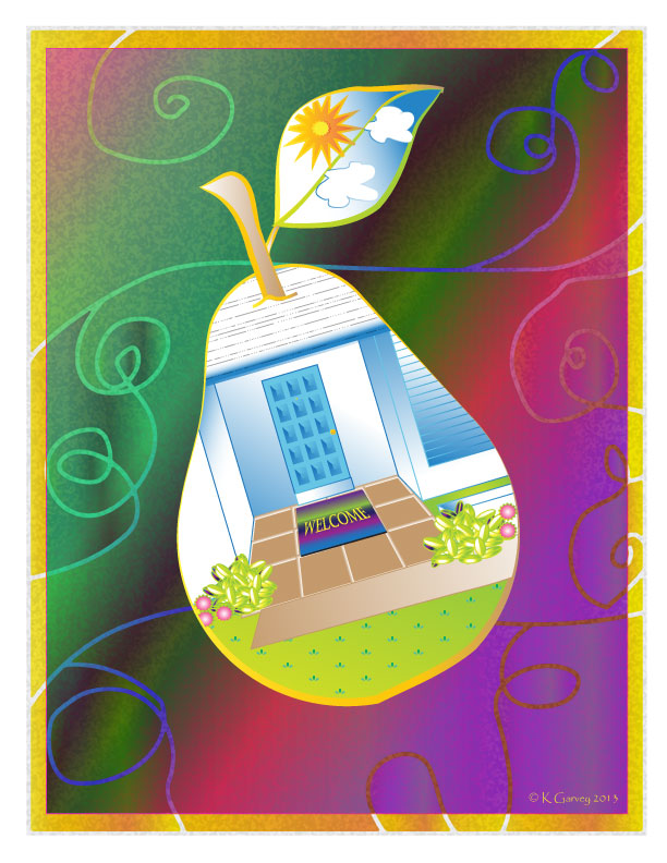
An Illustrated Pear: Masking

Third in my series of learning Illustrator CS6 was a study of masking. Again, I used a pear for the design element, this time copying my pear from the prior illustration and just modifying the leaf shape slightly. I filled it in with a little gradient and pattern and rotated it. I also added a variable width stroke in gold to the pear and stem. (Love some of these new features that I have missed out on by stopping at CS3.)

But the goal was to fill the shape with something more complex, so I decided to frame my front door with the pear shape and call it Home Sweet Pear.
 Using some of the fun tools  (available in many prior versions) in Illustrator, like Divide Into Grid I was able to build a copy of my front door and then use blends to create the wooden panels.  Divide into Grid also helped create the slats on the hurricane shutters and the squares on the tile entry.
After the little smidgen of landscape that would show was added by creating symbols of leaves and flowers, I copied the shape of the pear to the top of the layer, selected the layer and clicked on the Create Layer Mask Icon at the bottom of the Layer Panel. Presto! All the little edges and things that don't fit get perfectly covered up by the pear shape! (I love masks - in Illustrator and Photoshop they give you such beautiful results and make jobs that would be difficult so simple.) Rotated the view to match the pear's rotation. Then created a little sunshine and clouds for the leaf and masked them in the same way.

Things are still easily added into the clipping mask just by dragging them into that layer so I built a welcome mat, and dragged it to the pear layer.

Added a background of rectangles filled with gradients and cut them up with the knife tool.

Next, tackling Mesh!

Ballard Park, Original Oil on Canvas

  I had not painted outside in two years, so this was quite a challenge. It was one of those paintings I had to improve upon in the studio. ...