Tuesday, October 31, 2017

As artists, we experiment all the time when we create. If you are reading this, you, as a creative person, try new things as well. I love experimenting with new and different media. Just remember the fun of it isn't trying to create the next big masterpiece. It's to have fun, stretch where you might not have gone before, and try to improve on your craft.

This fish was an experiment with the Elegant Writer, normally used as a lettering pen. 
My friend and fellow artist, Kathy Garvey enlightened me on how they work.
Draw it, wet it, then spray with water and the pigment becomes more permanent. Wow! It achieves a certain inky look and the color you see comes from the pen.

Jean Thomas
Ozworks22@cfl.rr.com

Pieces of Eight Group Challenge #7 "Experiment"

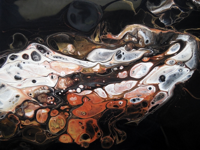
Experiment?  That's my middle name and I am always up to something outside the world of painting. My latest experiments have involved making natural dyes and trying to coax color from vegetables, leaves and spices.  As one thing leads to another I stumbled into eco-printing both on silk and on paper.  Here are my latest experiments on paper.


You see solidago, geranium leaves, maple leaves, hydrangea petals and marigold.  For more info check out my blog at:

  Cindy Experiment Michaud


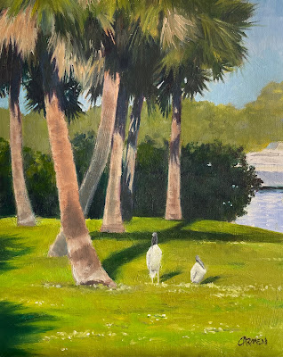
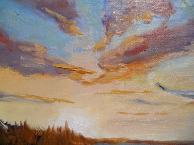
This painting was a real experiment for me.  I wanted to paint a sunset, wildlife and marsh, but could not find a reference image  that I liked.


Purchase here


Then I remebered a workshop I took, many years ago from Fritz vanEeden.  Fritz is an artist of international aclaim.  Among his many talents is his ability to paint images that he pulled from his mind's eye.

I gave it a try!


detail

I started with the direction of the sky and clouds and then laid in the  wetlands below.


I have to admit, I did use a photo reference for the heron.  I just could not visualize all those body parts!

All in all, I was happy the day's efforts, and hopefully, this technique will come in handy in the future.

Carol Schiff


I really like getting away from oil for awhile and trying new techniques.  I usually do a collage or even a pouring but I have discovered an entirely new medium, alcohol inks.  I love the "lava lamp" effect they have.  I think with some experimentation I could control the flow of the inks better and use different mediums to display them.  Right now I am using yupo paper and tiles.  The inks do so much better on a smooth surface.
Here are two tiles I did with similar color palettes. 


This one is very loose.  Notice all the spotting, this is from spraying alcohol on the paint.


This one is more controlled.  I tried putting down the alcohol and pouring in that area then moving slowly around the tile.  This reminds me of a landscape with a sky, mountain, trees and a lake.

Donna Vines
donnavinesart.etsy.com
donnavinesart.blogspot.com


 Mantilla, 5x7
I have been experimenting with transferring images using liquid medium. I painted the background with gold craft color, then transferred the images onto the paper. Most of the morning glory--or is it a Victrola?--is pen and ink. 
Windmill, 6x8

The windmill is transferred onto paper coated in copper paint. I drew the tulips in pen and ink.

Carmen Beecher
carmenbeecher.com
carmensart.etsy.com
carmenbeecher.blogspot.com

-----------------------


For our Experiment challenge, I wanted to try a watercolor technique where you apply a layer of plastic wrap to the wet colors and remove it after it dries. I like a more controlled style, so this was a real challenge for me. Since the effect reminds me of underbrush, I used the technique for creating backgrounds for a those tiny little chrysalises you find hidden in vines. 


Laying the plastic on for pupa # 5 below

Results after it dries

Thought I'd try lots of layers and colors for #6 (mistake!)
Below are the final paintings. The first two went fairly quickly. But the final four were time consuming.
Painted in order left to right, top to bottom. Pupa 01-06. Each has that number of times I applied paint with plastic wrap. Click the image for a larger view.

What did I discover from the experiment? I like it as a very light background. (As in I like the first two.) The more chaotic it got (I applied more and more layers of paint and plastic wrap in heavier colors as I progressed through the series) the more I was out of my element! I really struggled to make the last two into anything I could live with. It is a very good technique, however, for creating the look of underbrush! Once I master it, I might try using it for paintings of the Liguus tree snails I love so much!

Kathy Garvey
for more watercolors, visit my Etsy shop


As artists, we experiment all the time when we create. If you are reading this, you, as a creative person, try new things as well. I love experimenting with new and different media. Just remember the fun of it isn't trying to create the next big masterpiece. It's to have fun, stretch where you might not have gone before, and try to improve on your craft.

This fish was an experiment with the Elegant Writer, normally used as a lettering pen. 
My friend and fellow artist, Kathy Garvey enlightened me on how they work.
Draw it, wet it, then spray with water and the pigment becomes more permanent. Wow! It achieves a certain inky look and the color you see comes from the pen.

Jean Thomas
Ozworks22@cfl.rr.com

Sunday, October 29, 2017

Creative Collaborations
by Fay Picardi

One of my favorite ways to create is collaboratively.  As both an artist and a poet, I delight in exploring the myriad of possibilities for combining disciplines.  Case in point is The Transformations project of several years back where 13 artists and 13 poets worked together to inspire each other and produce new works for a museum show and book at the Foosaner Art Museum.  

This current collaboration is of another type.  Let me explain. The whole concept started when I was given an exceptional work of art by my sister. Originally a gift from her to my mother, the large pot shown below is an early piece by Paul Chaleff, a world renowned ceramicist and teacher whose works are in major museums.


This piece is extraordinary on its own. Perhaps I should have left it that way. However, I started on this adventure by deciding that it needed “a little something.” A few Bird of Paradise leaves???


But, NO. I wanted something unique and colorful. Something worthy of being called ART, too. 

Kathy Garvey, a fellow Pieces of 8 whom I had met working on Transformations, came to the rescue and volunteered to help me! Kathy suggested we design and print fabric leaves at Spoonflower. (Spoonflower prints fabric for artists, designers and fabricators all over the world.)  Plus, she had created artificial butterflies for florists, so she knew the tools and techniques needed. Great!

I wanted the leaves to be spectacular (of course)! Also I wanted them to coordinate with the other beautiful artworks in the room, so I sent Kathy some inspiration pictures and a color chart.


Kathy took these ideas and photos of three of my favorite paintings in the room (Hot Horizon and Evening Glow by George Snyder, and L'eau de Nil by Denette Schweikert), put them into Adobe Illustrator and built some swatches from all the colors.


Then, Kathy started filling her sketchbooks with some early ideas for our leaves.


She did a color test for my approval…shown below with notes.


Next, Kathy tested our idea by creating some leaves in her favorite colors, printing them at Spoonflower and assembling them. Her production sheet and finished leaves are below.


Beautiful! Now we just had to come up with something that worked for my living space!

After much deliberation, Kathy presented some "cartoons" of banana like leaves with each one representing a different artist involved in the project; poetry for me, cutouts from the paintings by Denette for her, stripes for George, and a few critters for herself.


The designs were perfect! Kathy worked up one of the cartoons in Illustrator in full color and we used Photoshop to play other color options. Below is the test production sheet we had printed. 


Next, we each cut, stitched up several prototypes and discussed the colors that would work.

Kathy created the remaining three leaves, the largest, based on my input. They are shown below so that you can see some of the details. Mine is on the top with a Nautilus and lines from my poetry. Denette's is in the middle with details from her paintings and Kathy's is on the bottom with a snail, butterfly and bug. Touches of George Snyder's colors and composition can be seen throughout.


Below is the fabric printed by Spoonflower to their sumptuous fake suede. 


Now, for my part: cut, back, sew, turn, arrange!

I first cut the fabric,


                                                      then the lining.


To finish, I sewed, clipped, turned and finished the leaves. After, I wired and covered the stems.

Finally, I arranged the leaves in Paul Chaleff’s pot.


Et, voila! Our collaborative artistic masterpieces in a master ceramist's pot.
I love them both!
Thank you, Kathy!

Another of my favorite collaborations was the publication, The Stones Speak. This work presented Cindy Michaud's artwork along with my poems. Kathy did the extraordinary layout and design for this book. She also edited and formatted my chapbook, Nana's Sunday Dance, and my novel, Simonetta. Without Kathy Garvey (on Etsy, on Spoonflower), none of these works would have come to fruition! No wonder I like collaboration! Thanks again, Kathy.  

Friday, October 27, 2017

Flower Painting, Iris Painting, Daily Painting, Small Oil Painting, 6x8" on Canvas Panel

I spent most of the spring in the mountains of North Carolina, surrounded by flowers everywhere.  They must have the perfect environment for flowers, and I loved every minute of it.  This is one of the beautiful iris' I photographed during my stay.

purchase here
I had a difficult time getting this painting to the finishing point, but turns out, my real struggle was in trying to get a decent photograph of it.  I find that blues and greens tend me merge when photographed, especially blues.  I took many photos of this painting, under different conditions, but I believe many of the subtle color changes were lost.  Note to self:  Don't do blue and green paintings, and don't do very dark paintings.....also impossible (for me) to photograph well.

In any event, thanks for viewing my art today.


Carol Schiff

Sunday, October 22, 2017

White Rose Painting, 8x10x1.5" Flower Still Life, Flower Painting, Floral Painting

Birthday Flowers!!

purchase here
Way back in December, my son and his wife sent me some beautiful flowers for my birthday.  The first thing I did was photograph them.  Then I forgot about the photos!

I finally found them last week, and decided to try my hand at one.  I am very intimidated  by flowers.  They seem so complex and I rarely meet that sweet spot between too little or too much detail.  I am not so sure about this one, but I do like the colors.

Try, try and try again!


Carol Schiff
www.CarolSchiffStudio.etsy.com
www.CarolSchiffStudio.blogger.com

Tuesday, October 17, 2017

Daily Paintings, Small Oil Paintings, Animal and Bird Paintings

I was looking at some of my images and was really surprised to see how many bird and animal paintings I have done.  I thought today would be a good day to post a few of my old time favorites.

Great Blue Heron
250 + shipping


Just Ducky
99 + shipping
  
SOLD


SOLD


SOLD


SOLD
It is always interesting and educational to review the painting journey that you have been on.  I like to line up older paintings, chronologically, which helps me to see the improvements I have made and the ones I would like to make in the future.  Always an interesting exercise.

Have a painterly day and thanks for visiting!


www.CarolSchiffStudio.blogspot.com

Thursday, October 12, 2017

Small Abstract Painting, Daily Painting, Metallic Paints, 6x8x.75" Abstract

One of my favorites, so far!


Purchase here


I got excited about this one!  The metallic gold and copper paints are very effective.  The listing above is for a giclee print, in the size of your choice.  If you are interested in the original, check with me for availability.

detail


Thanks for visiting my blog today!


Carol Schiff

Saturday, October 7, 2017

Rose Trellis Oil Painting, Garden Painting, 8x8x1.5" Small Landscape

I have always had a vision of the perfect garden, and it has always included a rose trellis.  Alas, it is not to be, for me.   But, I can paint one!


Purchase here
 Actually, now that I think about it, this is much more my style.  No maintenance required!


Have a rosy day!

Carol Schiff
www.CarolSchiffStudio.etsy.com
www.CarolSchiffStudio.blogspot.com

Monday, October 2, 2017

Small Landscape Painting, Daily Painting, Small Oil Painting, "Deep Purple" 6x8" Oil

Purchase here

I've got a thing for purples, lavenders, blues, blah, blah, blah.


detail
I was in the Land O' Trees, better known as western North Carolina, when I painted this.  In the summertime, I get green overload here.  Green mountains, green grass, green leaves.  You cannot escape green.   Maybe that is why doing a purple and blue landscape appealed to me.  More to come!


Carol Schiff
www.CarolSchiffStudio.etsy.com
www.CarolSchiffStudio.blogspot.com

Ballard Park, Original Oil on Canvas

  I had not painted outside in two years, so this was quite a challenge. It was one of those paintings I had to improve upon in the studio. ...