I love color, especially all the luscious paint colors available, so this was rather confining for me. To make it even a little more difficult, I chose to paint a scene without much color of any type.
 |
| Purchase here |
 |
| Jonathan Livingston Seagull lives on! |
Carol Schiff
www.CarolSchiffStudio.etsy.com
This was a really fun challenge. Limiting your colors is a great exercise because it forces you to mix colors and experiment. I did 2 paintings. My Teapot is using most of the colors just as they are, only the background is a mix I wouldn't have normally tried. The Laundry painting has lots and lots of greens in it, this was the challenge. If you really look at the greens you see lots of yellow, reds and blues.


Teapot
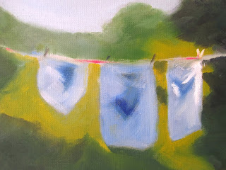
Laundry
Donnavinesart.etsy.com
Donnavinesart.blogspot.com
----------------------------
by Kathy GarveyThis was a really fun challenge. Limiting your colors is a great exercise because it forces you to mix colors and experiment. I did 2 paintings. My Teapot is using most of the colors just as they are, only the background is a mix I wouldn't have normally tried. The Laundry painting has lots and lots of greens in it, this was the challenge. If you really look at the greens you see lots of yellow, reds and blues.


Teapot


Donnavinesart.etsy.com
Donnavinesart.blogspot.com
----------------------------
This was a good time for me to do a limited palette painting because after 50 years of using the same John Pike Palette and paints almost as old, I finally bought a new John Pike. I'm about to order all new watercolors from Ralph's Art Supply, but in the meantime I fished out my newest yellow, blue and red and added them to my brand new palette. The colors I used were Carr Yellow, Quinacridone Red and Joe's Blue. The setup and start are shown in the image below. (Click to enlarge.)

I painted the main leaf using mixes of all three colors on and off the palette. But for the three other leaves, I only painted with the primary color directly onto the paper. I stuck to blue and yellow for one, red and yellow for another and blue and red for another. Later I added the remaining color directly to the paper to make some shadows (or highlights in the case of the blue and red leaf).
Here's the end result. Chaotic, but colorful...just like Fall!

--
---------------------------------
---------------------------------

Waterlily
Oil
Carmen Beecher
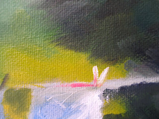
This was a real challenge because of the greens. Greens can be difficult enough without limiting the palette. Those bulb-looking things look like water hyacinths, which are very invasive, so I'm hoping they are something more friendly.
---------------------------------

Watercolor Sketch
by Jean Thomas
The goal here was to make believable facial tones using only three colors. My choices
were alizarin crimson, pthalo blue and burnt sienna. You can get tonal depth with a limited palette. A limited palette in watercolor can help keep your colors from getting muddy. The other secret is to layer on the color, waiting until each layer is dry before adding another.
***********
And Now for a Totally Different Take on This Challenge
I have never been a particular fan of pointillism. This technique has always seemed to me just that: Multicolored little points or dots. However, there are a few paintings from the period which seem to me to have captured the spirit. One of those is Grand Canal (Venice) by Paul Signac.

Nope. Didn't choose anything that grand. Decided to go with a simple, yet perfectly designed cup. Made it easy by choosing the one with the required colors. So here she is. (I forget. Is a cup masculine or feminine? Yep, she's definitely feminine. At least in French. Une tasse.)
My Chosen Cup ... And My Dots: Une Tasse by Fay Picardi